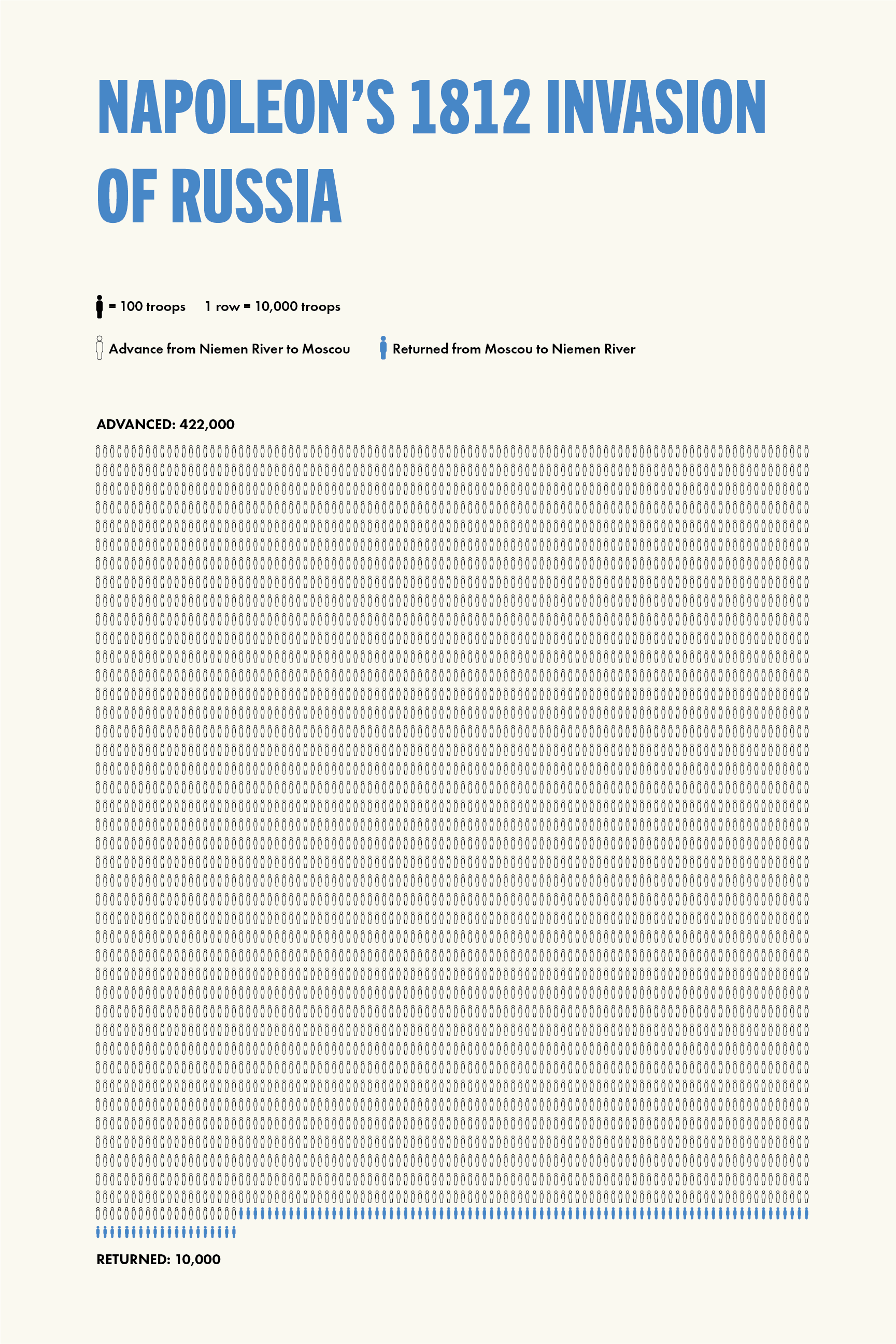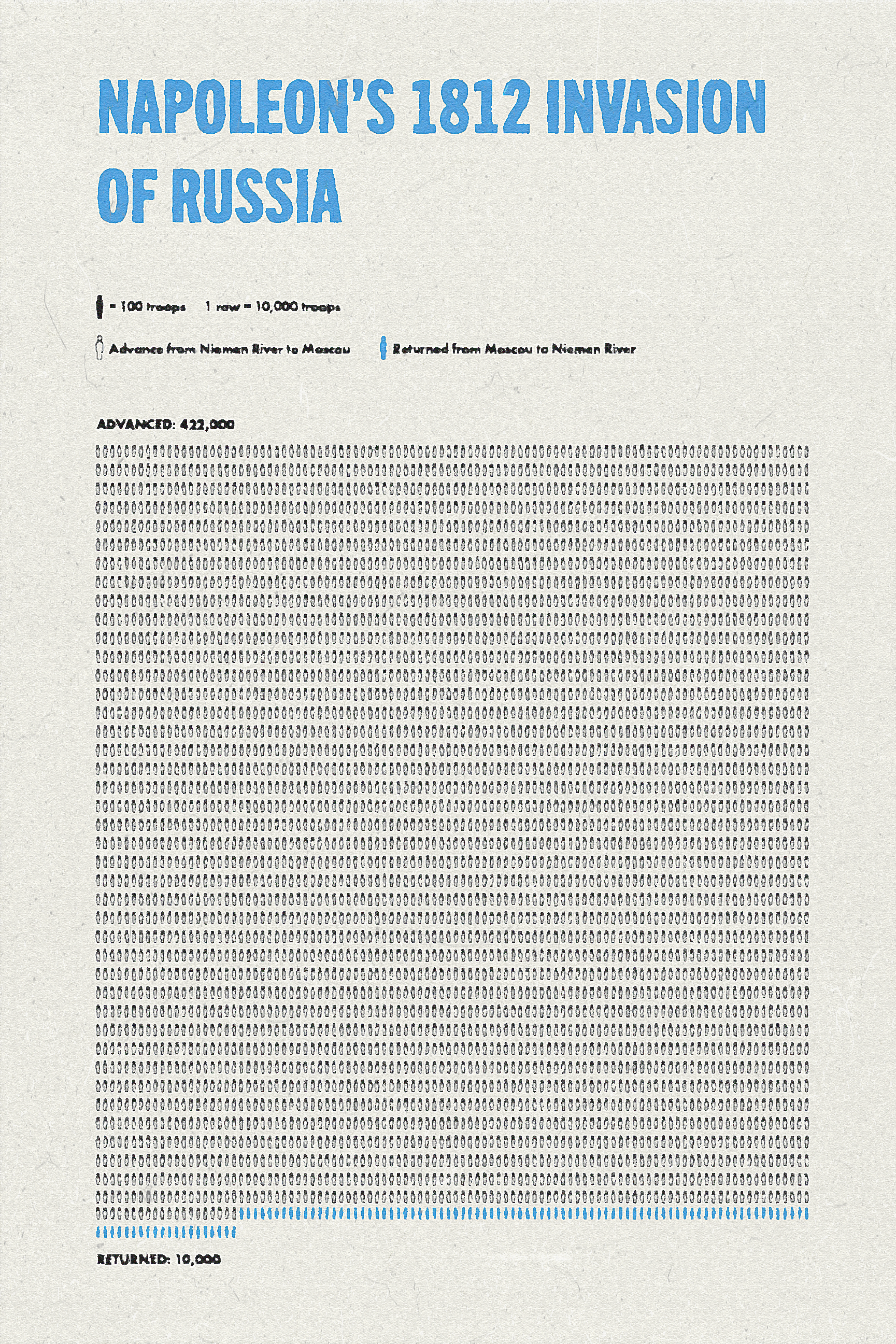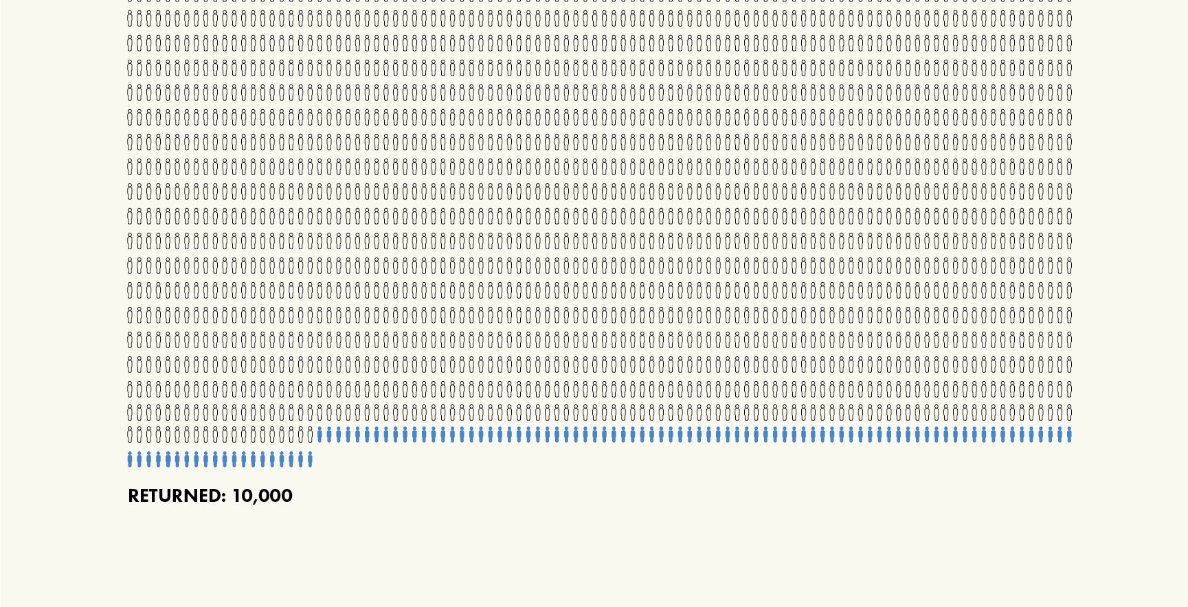
A project for a class I am currently taking asked us to redesign a well-known information graphic. For this project I chose Charles Joseph Minard’s portrayal of Napoleon’s disastrous 1812 invasion of Russia. I chose to not redesign every aspect of the graphic, as I thought it does quite well at being what it is. Instead, I chose to focus purely on the loss of life. Specifically, the comparison between the number of troops who began the invasion with Napoleon and the number of troops who returned home. Below is the graphic as I designed it in Adobe Illustrator, as well as a version I just did up for fun that is made to look like an old printed copy.
Clicking on either image will load a gallery view to better view the graphic.