
*Photo by Tima Miroshnichenko from Pexels*
Introduction
In the process of writing the post ‘Baseball - A Defensive Critique’ I discovered an R package I quite liked. This is the ggfortify package. I wrote quickly about why I liked this package in that post, but I wanted to write a little more on it. And maybe turn this into a series of posts about R packages I’ve come across or use regularly.
ggfortify
Developers
The developers & authors of ggfortify are Masaaki Horikoshi, Yuan Tang, Austin Dickey, Matthias Grenié, Ryan Thompson, Luciano Selzer, Dario Strbenac, Kirill Voronin, and Damir Pulatov.
My Thoughts
So, what’s so great about ggfortify? The main reason that I like ggfortify is that it allows you to create the diagnostic charts for a linear regression model without having to use R's plot() function. Why I like this is that it allows you to use ggplot syntax, which in turn gives you more control over the plot. Something I care very much about. I personally like to use custom fonts, change margin lines, backgrounds, plot colours, alpha channels (transparency), etc. I find ggplot syntax is much easier to do all this with. The use of ggplot syntax is additionally useful as it makes the code for producing the plot more reproducible and traceable.
In addition to being able to use ggplot syntax, ggfortify allows all this with ggplot's simple autoplot() function. It is great to be able to use only one function to produce all the diagnostic plots. Something that R's plot() function had going for it. Being able to use ggplot's syntax to produce diagnostic charts is an excellent feature of this package.
Autoplot() VS. Plot()
In doing this post, I initially planned on just writing about what I liked about ggfortify. However, I realized that it would probably be useful to also provide an example of what the package does through the autoplot() function as compared to R's plot() function.
The code I’ll be using for this is from the ‘Defensive Critique’ post and is available on my GitHub.
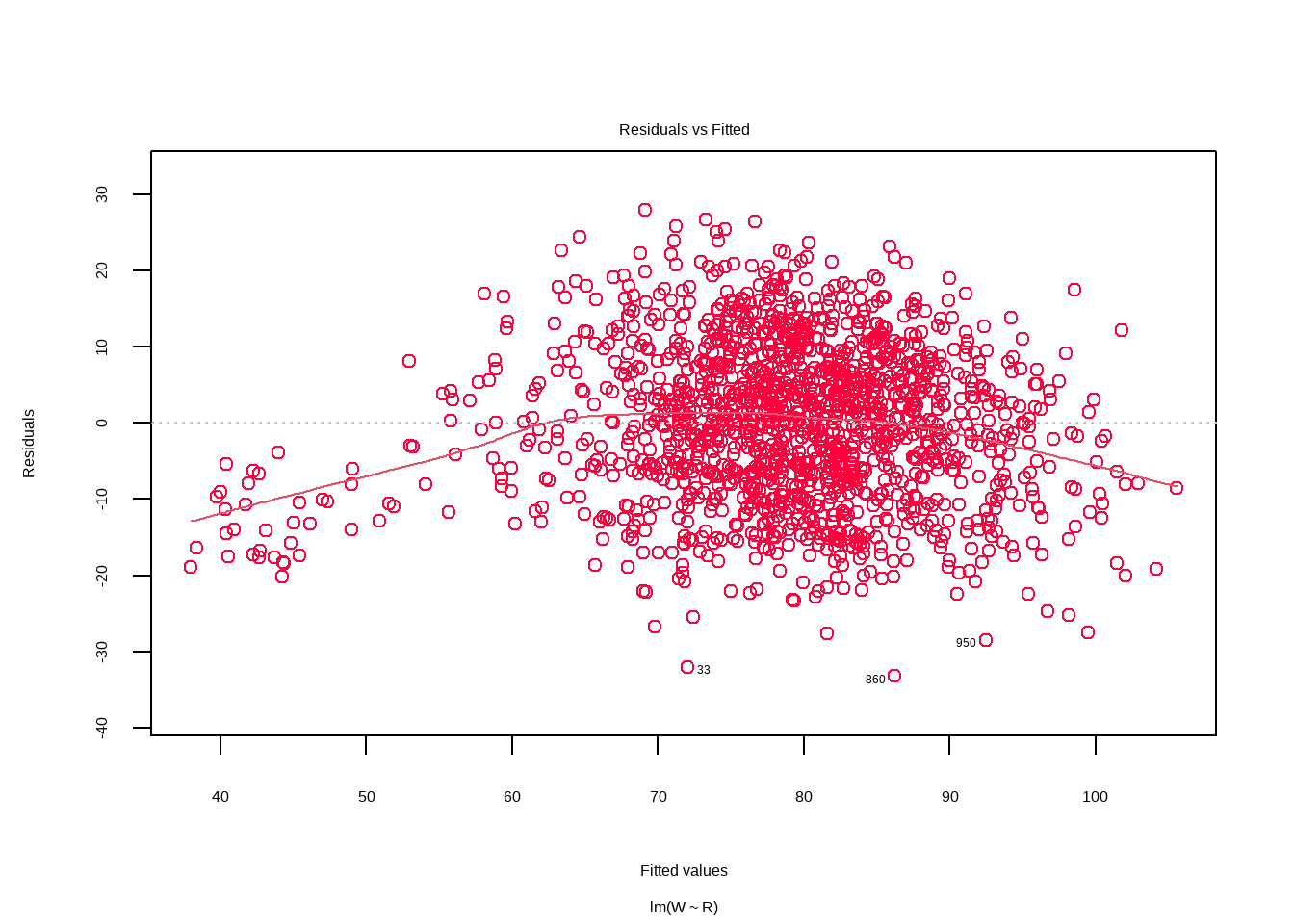
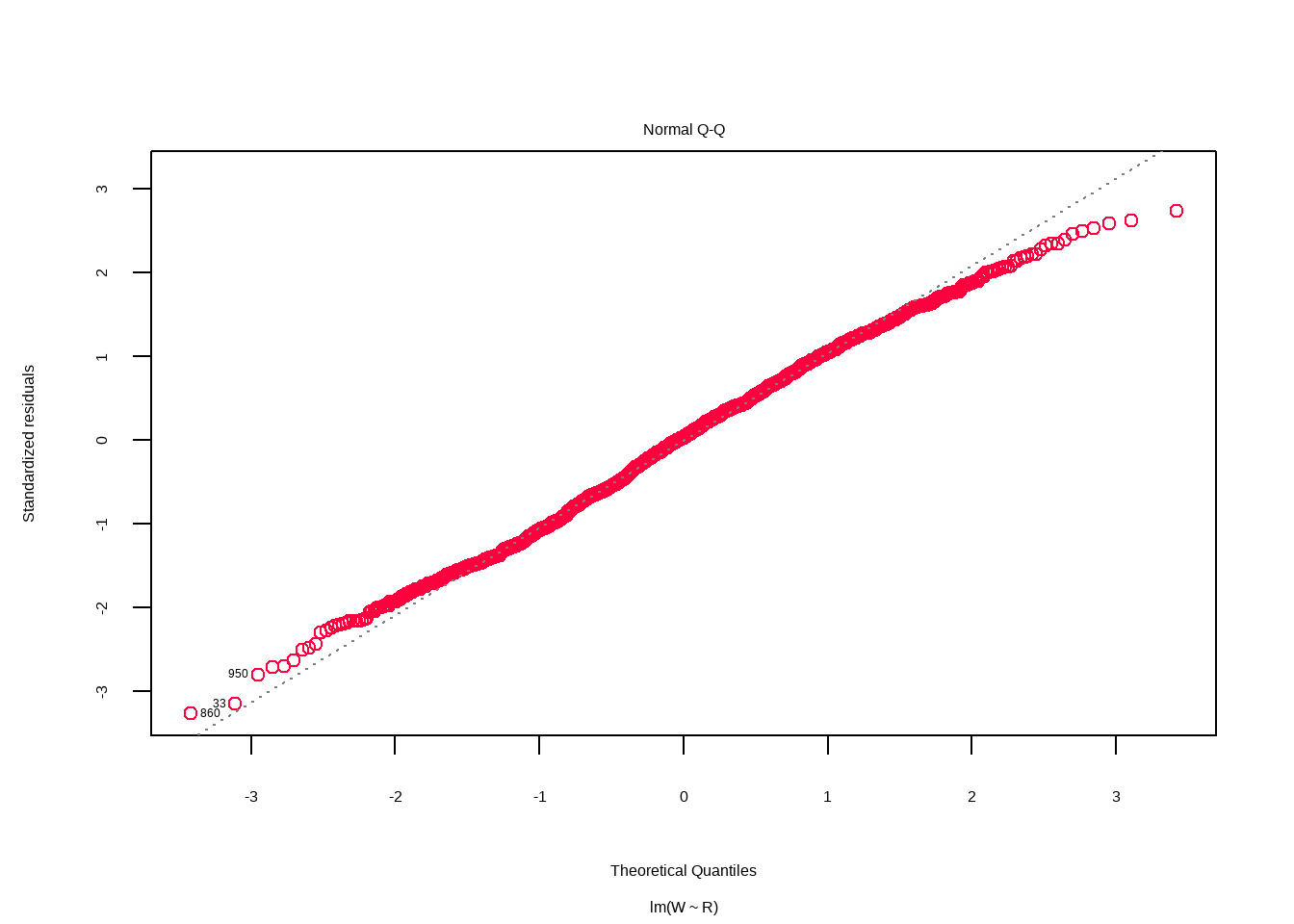
First is the plot() function from R. It’s a nice and simple function that just takes the one argument, the model, and produces understandable diagnostic plots.
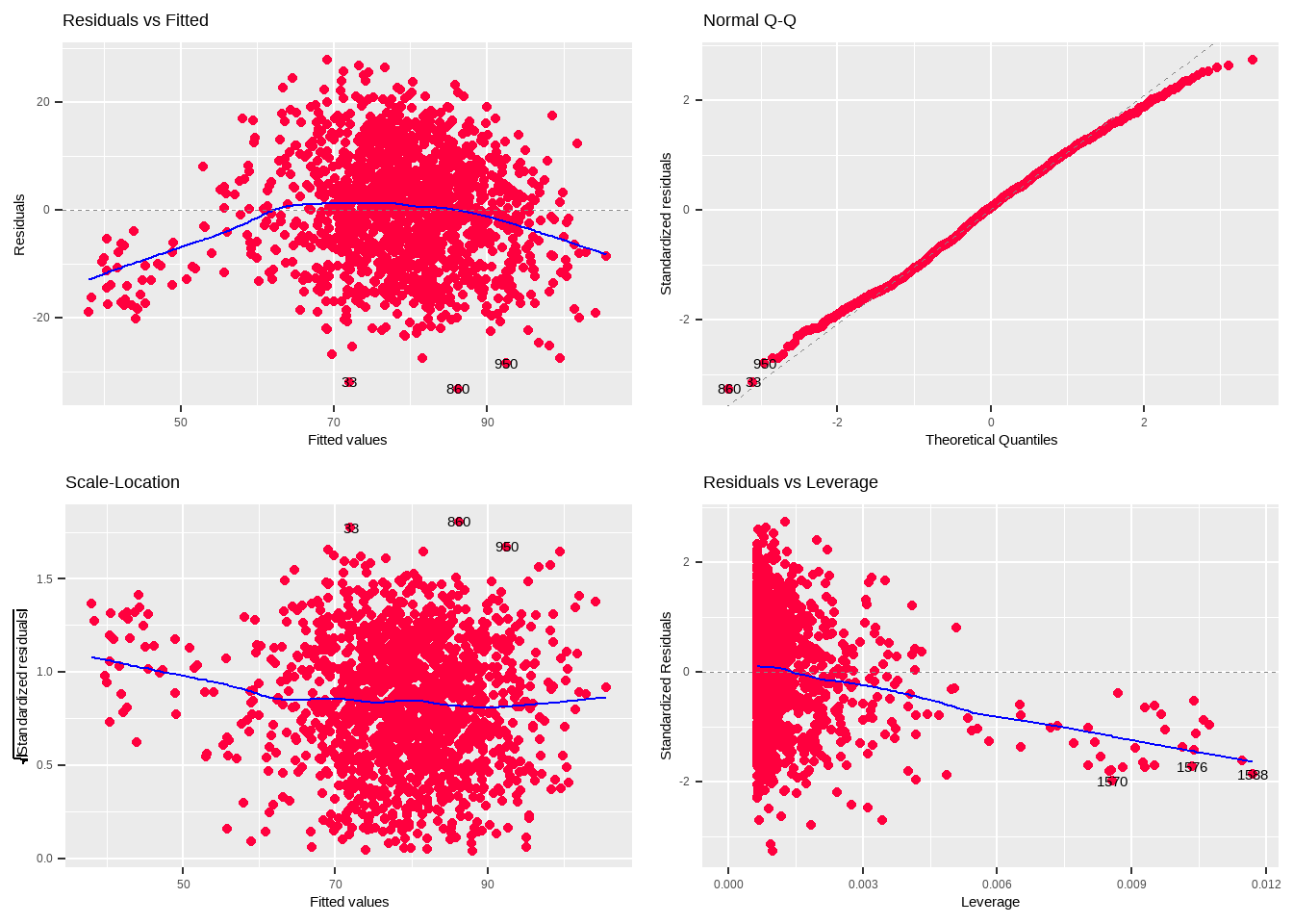
plot(wins_runs)


Ta da!
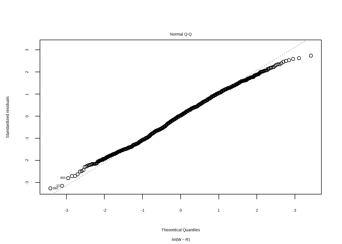
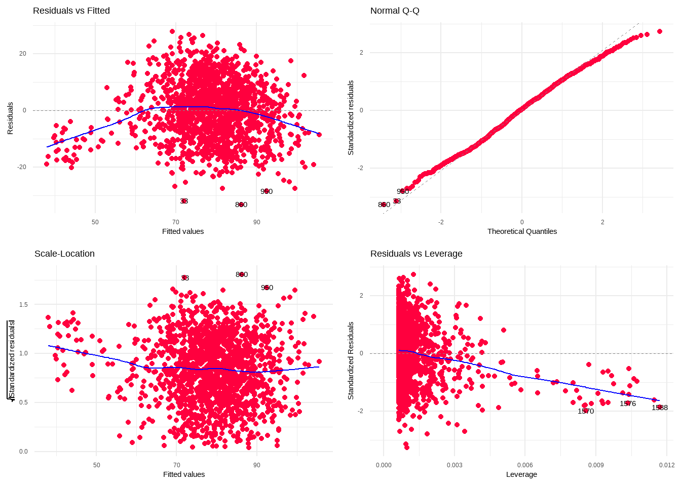
In comparison, here are the default plots created by the autoplot() function.
autoplot(wins_runs)
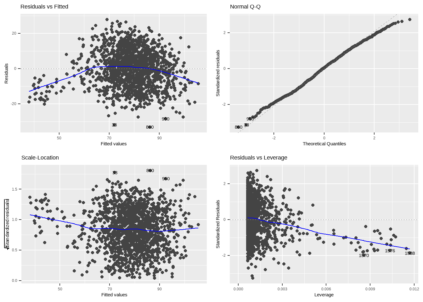
I’ll let you draw your own conclusions as to which you prefer. I personally like that the plot() function includes the Cook’s distance line. Although, autoplot() does just seem to cut the plot off at that point anyway.
However, what I said I liked about using autoplot() over plot() was the ability to control the design of the visuals. So, next I’ll compare changing the colours.
plot(wins_runs, col = "#ff003e")


And here is autoplot in comparison.
autoplot(wins_runs, colour = "#ff003e")
Both are fairly straightforward. Alternatively, here is autoplot() using the minimal theme from ggplot
autoplot(wins_runs, colour = "#ff003e")+
  theme_minimal()
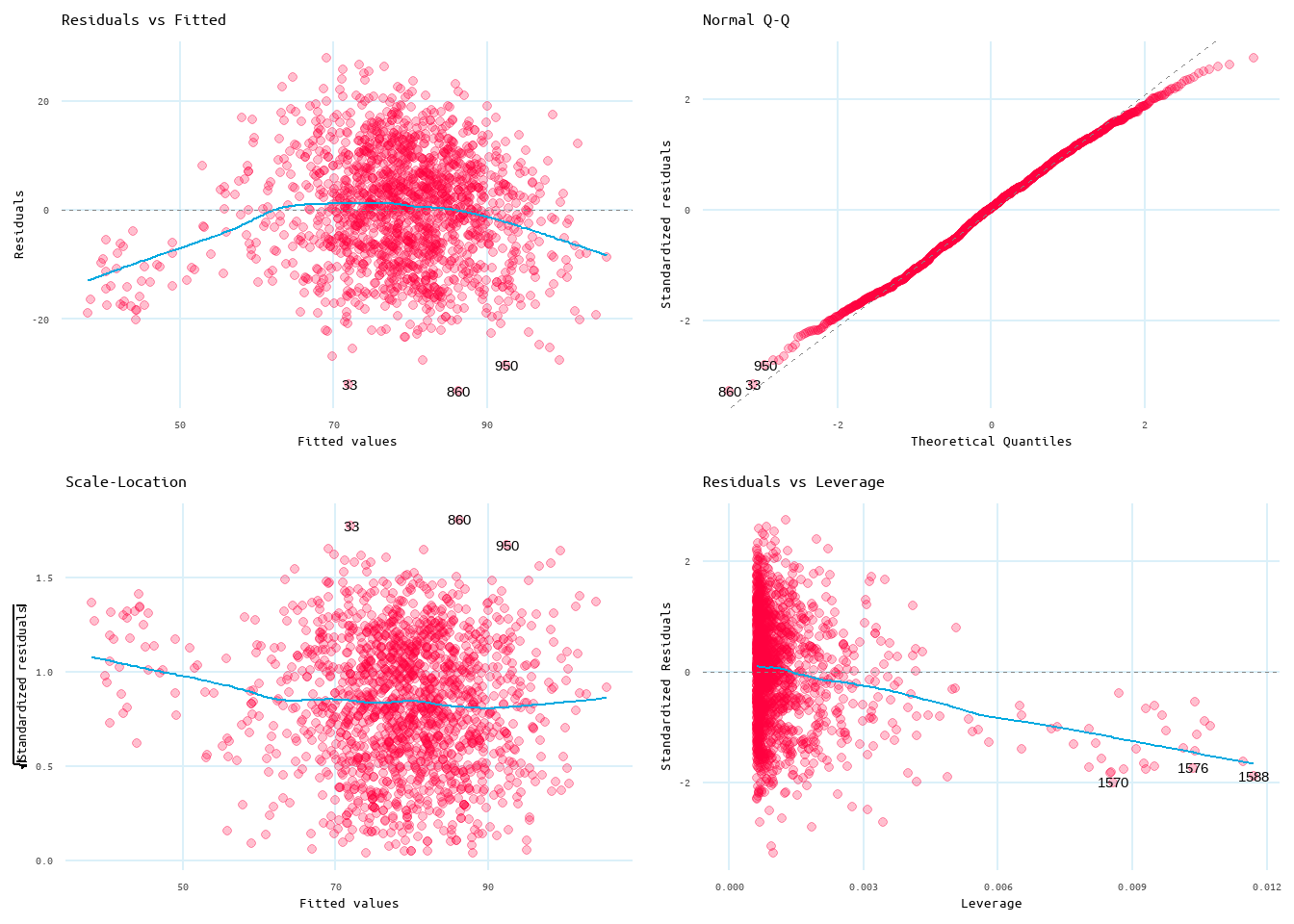
And lastly, here is autoplot() using the minimal theme with some customization like alpha, font, diagnostic line, and panel grid lines.
autoplot(wins_runs, colour = "#ff003e", smooth.colour = '#00a9e0', alpha = 0.25)+
  theme_minimal()+
  theme(text = element_text(family = "ubuntu-mono"),
        panel.grid.minor.x = element_blank(),
        panel.grid.major.x = element_line(colour = "#DBF0F9"),
        panel.grid.major.y = element_line(colour = "#DBF0F9"),
        panel.grid.minor.y = element_blank())
Closing Thoughts
I think, if you’re just needing to produce quick diagnostic charts without loading in other packages, then plot() will work perfectly for you. However, if you’re already using ggplot and you’re going to be creating diagnostic charts that you want to be able to customize beyond some colour and background changes (I left the background white for plot() as that’s the background I generally use, but this is something you can change), then also load ggfortify as this will give you greater creative control (I particularly like the ease of changing the diagnostic line). Additionally, you gain the benefit of being able to use a custom font. Something you can set through ggplot and showtext that I touch on in this post.
P.S. Another thought I had after writing this, but that I thought I should include, is that this is also a great way of saving space when writing a report with a page limit. Say, for instance, if you are writing for a class 😉