
*Photo by cottonbro from Pexels*
Introduction
So, continuing on my post about the ggfortify package, I thought I’d post about another package that I’ve come to use in pretty much every project that involves data viz and ggplot. This is the showtext package, which allows you to use fonts from Google Fonts with ggplot plots. It’s ahmazing.
showtext
Developers
The author/maintainer of the showtext package is Yixuan Qiu.
My Thoughts
I am personally not a big fan of the default fonts used with either R plots() or ggplot. I know that there is the extrafont package that allows you to use system installed fonts, but most of the fonts I use are through my Adobe CC account so they aren’t directly installed on my computer. As a side note, if someone has a way of using Adobe fonts within R and ggplot I would be very grateful to know how.
So, when I found showtext I was very excited at the ability to call fonts from Google Fonts directly as there are quite a few good alternatives that are similar in appearance to the fonts that I enjoy using from Adobe.
How It Works
What is also great about showtext is that it is very easy to initialize and call a font from Google Fonts. All you need are two functions, font_add_google() and showtext_auto(). Of which there is an example the use of these functions in the following code chunk.
## add in fonts from Google fonts using showtext package
## use font_add_google() function to select the specific font from Google fonts
font_add_google(name = "Lato", family = "lato-sans-serif")
font_add_google(name = "Jost", family = "jost-sans-serif")
font_add_google(name = "Patrick Hand SC", family = "patrick-sc-cursive")

## use showtext_auto() to load the selected font(s) into R workspace
showtext_auto()
## if the data object has the given variable label
if(hasName(get(.data), .variable)){
}
In the above chunk I’ve called in three fonts. Lato, Jost, and Patrick Hand SC. The first is one that I’ve found is a good alternative to Futura, the second is a good alternative to Gill Sans, and the last is a handwriting style font that I like. These fonts are called using the font_add_google() function, which uses the arguments name and family. The first argument is what is used to find the font on Google Fonts while the second argument is what is used later to use the font in a ggplot plot.
The second function, showtext_auto() is what allows the font(s) to be used in the R space. This function doesn’t require any arguments.
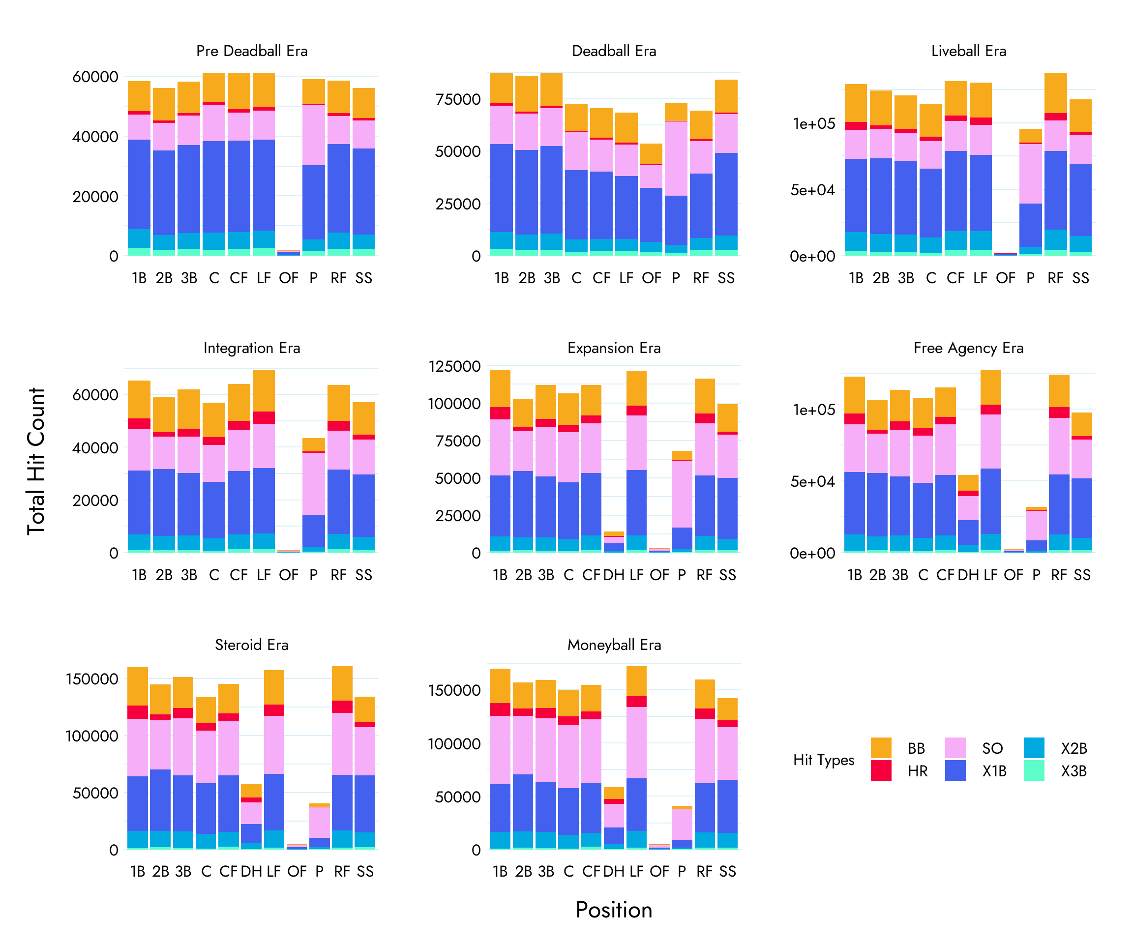
To get an idea of what this looks like I’ve generated the same plot three times with each plot using one of the three fonts previously loaded. I’ve included the code for each plot as well to show how to use the fonts within the generation of a plot using ggplot. For the curious, these are plots that show the differences in hit counts by position over different eras of baseball.
Plots
To set the font to be used in a ggplot plot, you need to set it within:
theme(text = element_text(family = "font-family-name"))
Where “font-family-name” is the family name that was set earlier in font_add_google(). Below you can see how it is used within the full construction of a ggplot plot.
Side-note: The font sizes I’ve used in the following plots aren’t necessarily the sizes that should be used if generating these plots for a PDF or in an HTML document. I’ve exaggerated the font sizes for visibility in this post.
Jost Font
## use the pos_year_hits dataset for the plot
pos_year_hits %>%
  ## generate plot and set position for x and count for y
  ggplot(aes(x = pos, y = count))+
  ## generate a bar plot, set fill to fit type and stack by position
  geom_bar(aes(fill = hit_type), position = "stack", stat = "identity", alpha = 1)+
  ## set the plot theme to minimal
  theme_minimal()+
  ## set the plot font to jost
  theme(text = element_text(family = "jost-sans-serif"),
        ## set the axis text to size 24
        axis.text = element_text(size = 24, colour = "black"),
        ## set the axis title to size 36
        axis.title = element_text(size = 36, colour = "black"),
        ## set legend title to size 24
        legend.title = element_text(size = 24, colour = "black"),
        ## set legend text to size 24
        legend.text = element_text(size = 24, colour = "black"),
        ## set strip plot title size to 24
        strip.text = element_text(size = 24, colour = "black"),
        # set plot background colour
        rect = element_rect(fill = "transparent"),
        ## manually adjust the legend position
        legend.position = c(.84, .125),
        ## set the direction of the legend to horizontal
        legend.direction = "horizontal",
        ## remove minor x grid lines and set y grid lines to light blue
        panel.grid.minor = element_blank(),
        panel.grid.major.x = element_blank(),
        panel.grid.minor.y = element_line(colour = "#DBF0F9"),
        panel.grid.major.y = element_line(colour = "#DBF0F9"),
        ## adjust panel spacing for facet
        panel.spacing = unit(2.5, "lines"),
        ## adjust the plot margins
        plot.margin = unit(c(1, 1, 1, 1), "cm"),
        ## set the vertical adjustment to the axis titles
        axis.title.x = element_text(vjust = -2),
        axis.title.y = element_text(vjust = 3))+
  ## set axis titles
    labs(y = "Total Hit Count",
       x = " Position")+
  ## manually set the fill colours
  scale_fill_manual(name = "Hit Types", values = c("#F6AA1C", "#F5003D", "#F7AEF8", "#4361EE", "#00A9E0", "#5DFDCB"))+
  ## facet wrap plots by era
  ## use free scale to set both x and y scales to the plots values
  facet_wrap(vars(era),
             scales = "free")
Lato Font
## use the pos_year_hits dataset for the plot
pos_year_hits %>%
  ## generate plot and set position for x and count for y
  ggplot(aes(x = pos, y = count))+
  ## generate a bar plot, set fill to fit type and stack by position
  geom_bar(aes(fill = hit_type), position = "stack", stat = "identity", alpha = 1)+
  ## set the plot theme to minimal
  theme_minimal()+
  ## set the plot font to jost
  theme(text = element_text(family = "lato-sans-serif"),
        ## set the axis text to size 24
        axis.text = element_text(size = 24, colour = "black"),
        ## set the axis title to size 36
        axis.title = element_text(size = 36, colour = "black"),
        ## set legend title to size 24
        legend.title = element_text(size = 24, colour = "black"),
        ## set legend text to size 24
        legend.text = element_text(size = 24, colour = "black"),
        ## set strip plot title size to 24
        strip.text = element_text(size = 24, colour = "black"),
        # set plot background colour
        rect = element_rect(fill = "transparent"),
        ## manually adjust the legend position
        legend.position = c(.84, .125),
        ## set the direction of the legend to horizontal
        legend.direction = "horizontal",
        ## remove minor x grid lines and set y grid lines to light blue
        panel.grid.minor = element_blank(),
        panel.grid.major.x = element_blank(),
        panel.grid.minor.y = element_line(colour = "#DBF0F9"),
        panel.grid.major.y = element_line(colour = "#DBF0F9"),
        ## adjust panel spacing for facet
        panel.spacing = unit(2.5, "lines"),
        ## adjust the plot margins
        plot.margin = unit(c(1, 1, 1, 1), "cm"),
        ## set the vertical adjustment to the axis titles
        axis.title.x = element_text(vjust = -2),
        axis.title.y = element_text(vjust = 3))+
  ## set axis titles
  labs(y = "Total Hit Count",
       x = " Position")+
  ## manually set the fill colours
  scale_fill_manual(name = "Hit Types", values = c("#F6AA1C", "#F5003D", "#F7AEF8", "#4361EE", "#00A9E0", "#5DFDCB"))+
  ## facet wrap plots by era
  ## use free scale to set both x and y scales to the plots values
  facet_wrap(vars(era),
             scales = "free")

Patrick Hand SC Font
## use the pos_year_hits dataset for the plot
pos_year_hits %>%
  ## generate plot and set position for x and count for y
  ggplot(aes(x = pos, y = count))+
  ## generate a bar plot, set fill to fit type and stack by position
  geom_bar(aes(fill = hit_type), position = "stack", stat = "identity", alpha = 1)+
  ## set the plot theme to minimal
  theme_minimal()+
  ## set the plot font to jost
  theme(text = element_text(family = "patrick-sc-cursive"),
        ## set the axis text to size 24
        axis.text = element_text(size = 24, colour = "black"),
        ## set the axis title to size 36
        axis.title = element_text(size = 36, colour = "black"),
        ## set legend title to size 24
        legend.title = element_text(size = 24, colour = "black"),
        ## set legend text to size 24
        legend.text = element_text(size = 24, colour = "black"),
        ## set strip plot title size to 24
        strip.text = element_text(size = 24, colour = "black"),
        # set plot background colour
        rect = element_rect(fill = "transparent"),
        ## manually adjust the legend position
        legend.position = c(.84, .125),
        ## set the direction of the legend to horizontal
        legend.direction = "horizontal",
        ## remove minor x grid lines and set y grid lines to light blue
        panel.grid.minor = element_blank(),
        panel.grid.major.x = element_blank(),
        panel.grid.minor.y = element_line(colour = "#DBF0F9"),
        panel.grid.major.y = element_line(colour = "#DBF0F9"),
        ## adjust panel spacing for facet
        panel.spacing = unit(2.5, "lines"),
        ## adjust the plot margins
        plot.margin = unit(c(1, 1, 1, 1), "cm"),
        ## set the vertical adjustment to the axis titles
        axis.title.x = element_text(vjust = -2),
        axis.title.y = element_text(vjust = 3))+
  ## set axis titles
  labs(y = "Total Hit Count",
       x = " Position")+
  ## manually set the fill colours
  scale_fill_manual(name = "Hit Types", values = c("#F6AA1C", "#F5003D", "#F7AEF8", "#4361EE", "#00A9E0", "#5DFDCB"))+
  ## facet wrap plots by era
  ## use free scale to set both x and y scales to the plots values
  facet_wrap(vars(era),
             scales = "free")
Finishing Thoughts
So, if you’re going to be using ggplot and you don’t want to use the default font, I’d recommend using showtext. It’s a really easy way to use a custom font in a plot, and Google Fonts has plenty of fonts to choose from. I will say, please don’t just use a font that is trendy or overly styled. It will make your plot difficult ro read. You can see the difference in the comparison of plots that I generated by looking at the Patrick Hand plot compared to either of the other two.